QUEER CHOCOLATIER
brand identity system.
logo and branding developed, during my time in Studio 165+, for a new storefront
in Muncie, Indiana that strives to provide high-quality, handmade chocolate confections while
also standing in solidarity with queer and trans folks. they find beauty in diversity
and provide indulgence for all.


TEAM MEMBERS
Lauren Fox.
Kendra Schemmel.
Sylvia Marbach.
Kate Tomczak.
Miriam Ramirez.
Alexandria Southern.
Leah Callahan.
PROJECT OVERVIEW
challenge — create an brand identity that is carefully designed to feature characteristics that represent their vision, voice and products equally
solution — use their unique name to create a distinct system that embodies their vision, voice yet clearly defines what their product is in a creative way
outcome — designed the logomark to be an abstraction of "Q" and "C" combined to represent the shape of Queer Chocolatier's truffles. The tail of the "Q" forms the "C" and represents Queer Chocolatier flowing outside of conformity and onto their own path. the logomark is paired with strong yet elegant typeface to reiterate the craft and care put into their delicate products.


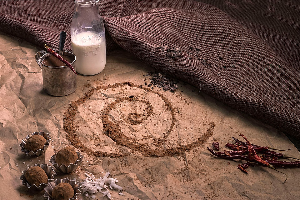
photography by Nikki Abel