David Owsley Museum
COMPANY:
PROJECT:
Accessibility Design
Graphic Designer
ROLE:
The David Owsley Museum of Art at Ball State University was founded in 1936 and therefore lack necessary accessibility
elements. There is not much we can do about the already established architecture but there are various solutions that are capable through design to make the building and experience more accessible.
RESEARCH
The accessibility design issue I decided to work with was low vision deficiency. With extensive research (ADA Standards and Smithsonian Guidelines) and information gathered during tours, personal investigation, and meetings with individuals experiencing this deficiency. I was able to identity key issues within everyday design and how to adapt the design to best suit these needs. More than 2.9 million Americans age 40+ have low vision and nearly 4.2 million are visually impaired in some way. There are various standards set within typography, spacing, hierarchy, white space, contrast of colors, material types and qualities, and other characteristics that require extreme close and particular detail when designing for low vision factors in order to design with optimal readability. It is also very important to understand how the other senses are used to help internally visualize things, navigate, and connect in different ways rather than relying on eye sight.
SELECTION OF DECISION POINTS
After much research and talking to our personal resources on campus who have first hand experience with this deficiency, I was able to see the major issue points present within the David Owsley Museum. The most important factor that needed adapted was the gallery cards. These are the main source of information for viewers for the artwork and it is an issue if they are unaccessible or unreadable. The next factor I focused on was creating an app for those whose low vision causes them to have to use additional technologies to zoom in and out of text to increase readability or for a read out loud option. Finally, the third main struggle was within the setup of the elevators. the elevators' button display was complex and unclear on what was a button or not, and therefore can become very confusing or frustrating for those with low vision.

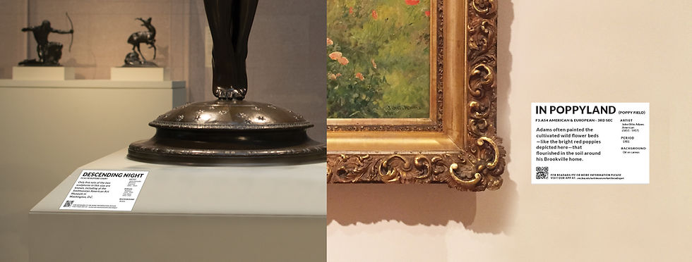
Solution 1 : Label redesign & 3D art experience (Tactile Supporters)

The main goal within this design solution is to create a design that creates an optimal level of readability. To achieve this I created a solid foundation and organized information through hierarchy and spacing . A layout with an adequate amount of white space to eliminate overwhelming and clustered information as well as limited text. Large, bold, sans serif font to increase readability both through style and contrast. The colors‘ contrast levels cleared the triple A readability test. A 21st century technology option for special artworks that has additional qualities such as language, font, and contrast adjust-ability; as well as a glare free - like ink on paper experience with lighting that is easy on your eyes. Three-Dimensional prototypes for sculptures and three-dimensional replicas of 2D artwork is provided to give the low vision audience an more clear internal visualization of the artwork through their sense of touch.
This solution consists of three similar but separate designs. The first part consist of a re-designing of the paper form of gallery cards. The second part is a design and set of settings for a technology version of the gallery cards capable through devices by Visionect. The third part was a more tactile (3-dimensional) version of the artwork being displayed so that the viewer could "see" the artwork more clearly through their sense of touch.
Part 1 : Gallery Card Re-design
Part 2: Visionect Gallery Card Re-design and Settings


Was inspired by the features and capabilities supplied by the technology of Visionect.
I redesigned its layout and created more settings to make it a more low vision deficiency friendly and accessible.
VISIONECT & RE-DESIGN INFO

Additional Screens


Part 3: Tactile Artwork | 3-dimensional

 |  |  |  |  |
|---|---|---|---|---|
 |
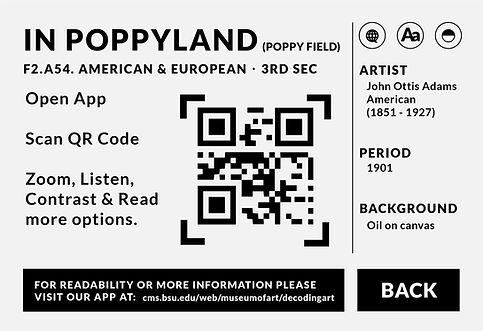
Solution 2 : Label app
The main goal in this design solution is to acquire more accessibility options for low vision audiences to have accessible.
Even after label restructure some individuals may have troubles reading information, or it simply takes too long.
This app allows navigation through the entire museums’ artworks with zooming, read aloud, and contrast capabilities, located at the top of every page to eliminate unnecessary switching to and from the home/settings to change preferences constantly. The app offers language and font settings that are changeable. The most important characteristic however, is the QR code where you can scan any QR Code on artwork labels and it will take you directly to that specified artwork without thorough navigation of the entire app. It is also stylized according to the ADA and Smithsonian guidelines, as well as acquiring consistency to the label solution to create a sense of predictability and ease for the user.


DOMA Label App
Solution 3 : Way-finding
The main goal in this design solution is to create a systematic and clear distinction with buttons and symbols on the elevators. With low vision it is difficult to distinguish buttons from symbols, especially when lacking contrast and hierarchy. Therefore, I combined the floor numbers and their buttons as one with high contrast to eliminate confusion on which one to push. The floor indicator will also be lowered to enable a more readable location. Then, with the simplification of symbols, achieving optimal level of contrast, changing the orientation of things, thus simplifying the user experience, will allow easier and faster use and understanding of the navigation within the elevators. There is also signage outside of the elevators that define what floor you are on and what rooms are offered there. The bright magenta painted wall by the elevator is implemented to create clear signals of where the elevators are located.

Before Images

